Color grading sits at the center of every unforgettable film, photo, or ad campaign. It is the invisible touch that makes a shot feel warm and nostalgic or cold and chilling. But most people do not realize that color grading is what separates raw footage from the cinematic masterpieces we remember, and over 80 percent of Hollywood films use customized color grading palettes for every project. Photographers, filmmakers, and brands all use this tool to tell their stories, but the real surprise is how much emotion and meaning can be changed with just a few creative tweaks. The magic is not in the camera or lens. It’s in the edit room, where color transforms ordinary visuals into true works of art.
Table of Contents
- Understanding What Is Color Grading
- Key Differences: Color Grading Vs. Color Correction
- How Color Grading Impacts Visual Storytelling
- Essential Color Grading Techniques for Creatives
Quick Summary
| Takeaway | Explanation |
|---|---|
| Color grading enhances emotional impact. | This technique allows creatives to evoke specific feelings by manipulating color tones and palettes effectively. |
| Differentiate between color grading and correction. | Understanding that color correction fixes technical issues while color grading adds artistic elements is crucial for visual storytelling. |
| Color grading shapes visual identity in branding. | Consistent color schemes can create immediate visual recognition and evoke emotional responses for brands across different media. |
| Master techniques for targeted color adjustments. | Using selective color techniques helps focus viewer attention and enhance storytelling by emphasizing key elements in visuals. |
| A structured workflow enhances results. | Developing a reliable process for color grading ensures consistency and allows for more creative and effective visual outcomes. |
Understanding What Is Color Grading
Color grading represents a critical post-production technique that transforms raw visual content into a cohesive and emotionally resonant experience. Academic research from digital imaging studies defines this process as a deliberate manipulation of visual tonality, color characteristics, and exposure levels to align imagery with narrative and emotional objectives.
The Fundamental Mechanics of Color Grading
At its core, color grading is a sophisticated visual editing process that goes far beyond simple color correction. Professional creatives use specialized software to adjust color temperature, contrast, saturation, and luminance to create a specific mood or visual aesthetic. Whether working with cinematic footage, photography, or digital illustrations, color grading allows artists to transform ordinary visual content into compelling storytelling tools.
The process involves multiple technical and artistic considerations. Colorists and editors carefully analyze each frame or image, making granular adjustments that can dramatically alter the viewer’s emotional perception. A warm color palette might evoke nostalgia, while cool tones can communicate isolation or detachment. These subtle manipulations require an understanding of color theory, visual psychology, and advanced digital editing techniques.
Professional Applications and Creative Impact
Color grading serves diverse professional contexts across creative industries. In film production, it helps establish genre, time period, and narrative tone. Cinematography experts note that blockbuster movies often use distinctive color grading to create memorable visual signatures. For instance, science fiction films might employ a teal and orange palette to suggest technological environments, while period dramas use muted, desaturated colors to represent historical authenticity.
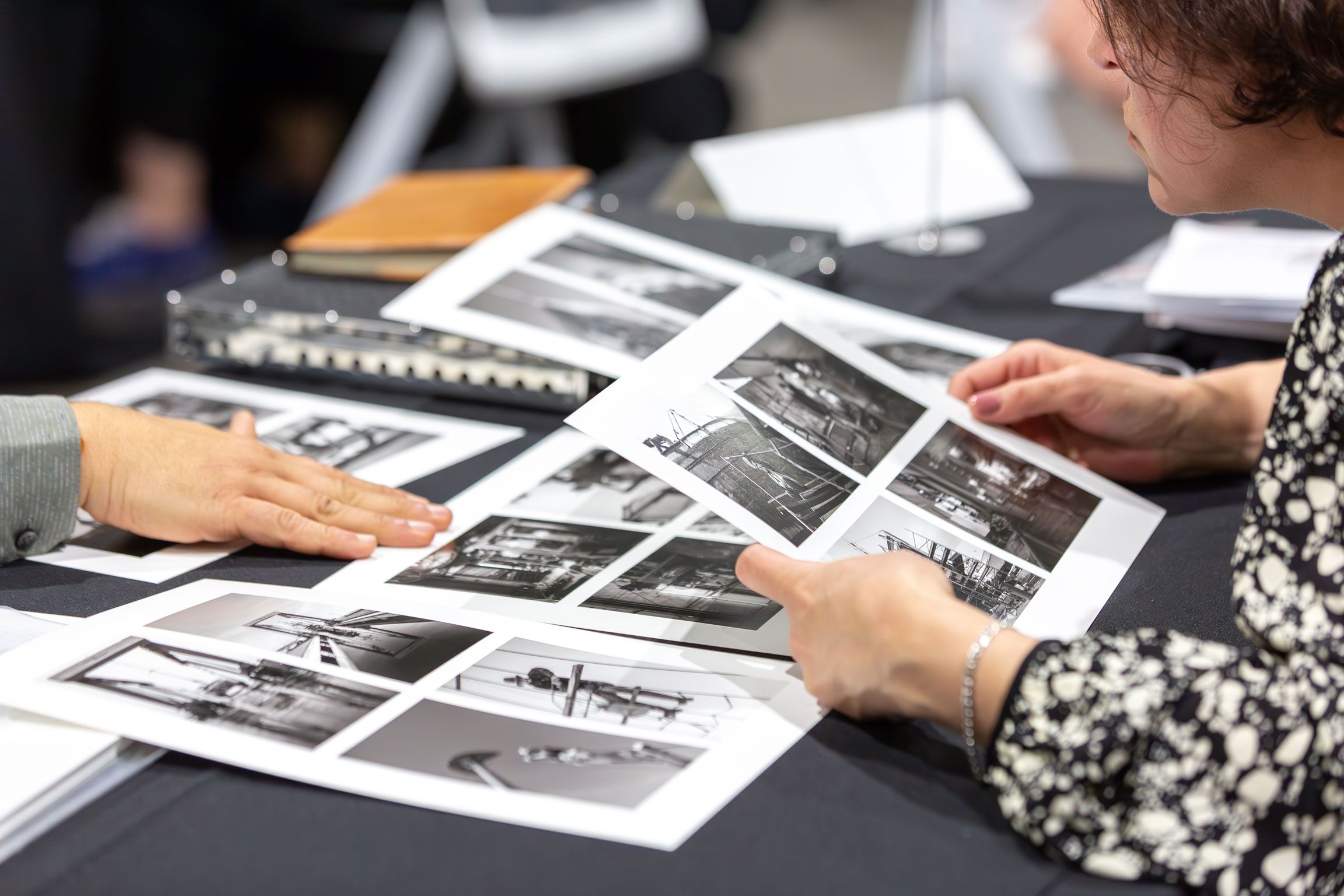
Photographers and visual artists similarly leverage color grading to refine their artistic vision. Commercial photographers use these techniques to create consistent brand aesthetics, while fine art photographers employ color grading as a form of creative expression. The process allows professionals to transcend the limitations of original capture conditions, transforming raw images into refined visual narratives.
Creative teams recognize color grading as an essential skill that bridges technical precision with artistic interpretation. It requires not just technical proficiency with editing tools, but a nuanced understanding of how color influences human perception and emotional response. Check out our comprehensive guide on photo editing terminology to deepen your understanding of these advanced techniques.
Mastering color grading demands continuous learning and practice. Professionals must develop an acute sensitivity to color relationships, understand software capabilities, and cultivate a unique visual perspective that transforms ordinary visual content into extraordinary artistic statements.
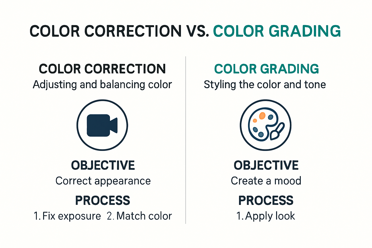
Key Differences: Color Grading vs. Color Correction
Color grading and color correction are often misunderstood as interchangeable processes, but they represent distinct stages in visual post-production with unique objectives and technical approaches. Professional color experts from the American Society of Cinematographers emphasize that understanding these differences is crucial for achieving professional visual results.
To help clarify the main distinctions, here’s a table summarizing the key differences between color grading and color correction as described above.
| Aspect | Color Correction | Color Grading |
|---|---|---|
| Purpose | Fix technical issues and standardize visuals | Add artistic style and enhance emotional impact |
| Stage in Workflow | First (initial adjustments) | Second (after correction) |
| Typical Adjustments | Exposure, white balance, color cast corrections | Color palettes, contrast, mood, tone adjustments |
| Professional Role | Ensures technical consistency | Transforms and stylizes footage or images |
| Emotional/Narrative Influence | Minimal (aims for accuracy) | High (sets mood, narrative style, visual identity) |
| Implementation | RAW file adjustments, technical balancing | Creative manipulation, artistic decisions |
| Application Examples | Balancing shots from different cameras or lighting | Giving a film a cinematic look, establishing brand identity |
Technical Foundations and Primary Objectives
Color correction is a technical foundational process focused on standardizing and fixing visual inconsistencies in raw footage or images. This initial stage involves correcting exposure, white balance, and resolving color cast issues to create a technically accurate baseline. Cinematographers and photographers use color correction to ensure visual uniformity across different shots, addressing problems like uneven lighting, camera sensor variations, or environmental color shifts.
In contrast, color grading represents a more creative and interpretative stage. While color correction establishes a neutral starting point, color grading transforms the visual aesthetic through deliberate artistic choices. Professionals manipulate color palettes, contrast, and tonal ranges to evoke specific emotional responses or establish a distinctive visual style. Research from film production studies demonstrates how color grading can fundamentally alter narrative perception and viewer engagement.
Workflow and Professional Implementation
The workflow between color correction and color grading is sequential and interdependent. Color correction must precede color grading to ensure a clean, consistent visual foundation. Professional creative teams approach this process methodically: first stabilizing technical elements, then applying creative color manipulation.
For instance, in film production, colorists might first correct exposure variations between different camera angles, ensuring consistent skin tones and removing unwanted color casts. After achieving technical uniformity, they then apply a specific color grade that might enhance a scene’s emotional tone—deepening shadows for a noir atmosphere or using warm, desaturated tones to suggest nostalgia.
Photographers and visual artists follow similar principles. Digital editing workflows typically involve initial RAW file adjustments to balance technical parameters before applying more interpretative color styling. Our comprehensive guide on photo editing terminology offers deeper insights into these professional techniques.
Professionals recognize that mastering both color correction and color grading requires a blend of technical precision and artistic intuition. The ability to move seamlessly between these processes distinguishes expert visual creators, enabling them to transform raw visual content into compelling, emotionally resonant narratives.
How Color Grading Impacts Visual Storytelling
Research from visual communication studies reveals that color grading is far more than a technical process—it is a powerful narrative tool that transforms visual content into emotionally compelling storytelling. By strategically manipulating color palettes, professionals can guide viewer perception, enhance narrative themes, and create immersive sensory experiences.
To further illustrate how different color grading choices impact emotion and narrative, here’s a summary table of common color palettes and their typical psychological effects as described in the article:
| Color Palette | Common Uses/Genres | Psychological/Emotional Impact |
|---|---|---|
| Warm (yellows, oranges) | Nostalgia, comfort, period dramas | Evokes warmth, safety, sentimentality |
| Cool (blues, teals) | Sci-fi, isolation, technology | Feels detached, futuristic, melancholic |
| Muted/Desaturated | Historical, realism, fine art | Suggests authenticity, solemnity, subtlety |
| Vibrant/Saturated | Awakening, growth, drama | Signals intensity, energy, transformation |
| Teal & Orange | Blockbusters, action, sci-fi | Creates depth, visual interest, tension |
Emotional Landscape and Psychological Impact
Colors possess profound psychological significance, acting as silent communicators of mood, tension, and emotional subtext. Visual storytelling experts emphasize that color grading allows creators to establish specific emotional landscapes without relying solely on dialogue or action. A desaturated blue palette might evoke melancholy, while warm, golden tones can suggest nostalgia or comfort.
Filmmakers and photographers strategically use color grading to create visual metaphors and reinforce narrative arcs. By subtly shifting color temperatures or adjusting contrast, artists can signal character development, temporal transitions, or psychological states. For instance, a gradual transformation from cool, muted tones to vibrant, saturated colors could represent a character’s emotional awakening or personal growth.
Narrative Coherence and Visual Identity
Color grading serves as a critical mechanism for establishing visual consistency and narrative coherence across different scenes and sequences. Professional creative teams use color grading to create unified visual languages that communicate genre, time period, and thematic undertones. Science fiction productions might employ teal and cyan palettes to suggest technological environments, while period dramas use muted, desaturated colors to evoke historical authenticity.
Commercial brands and marketing teams similarly leverage color grading to create distinctive visual identities. Explore our comprehensive guide on visual storytelling techniques to understand how color can become a powerful branding tool. By maintaining consistent color signatures across different media, organizations can create immediate visual recognition and emotional resonance with their audiences.
The nuanced art of color grading requires not just technical skills but a deep understanding of visual psychology, cultural color associations, and narrative design. Professionals must develop an intuitive sense of how color interacts with viewer emotions, transforming raw visual content into rich, meaningful storytelling experiences. Each color adjustment becomes a deliberate artistic choice, contributing to a more profound and immersive narrative communication.
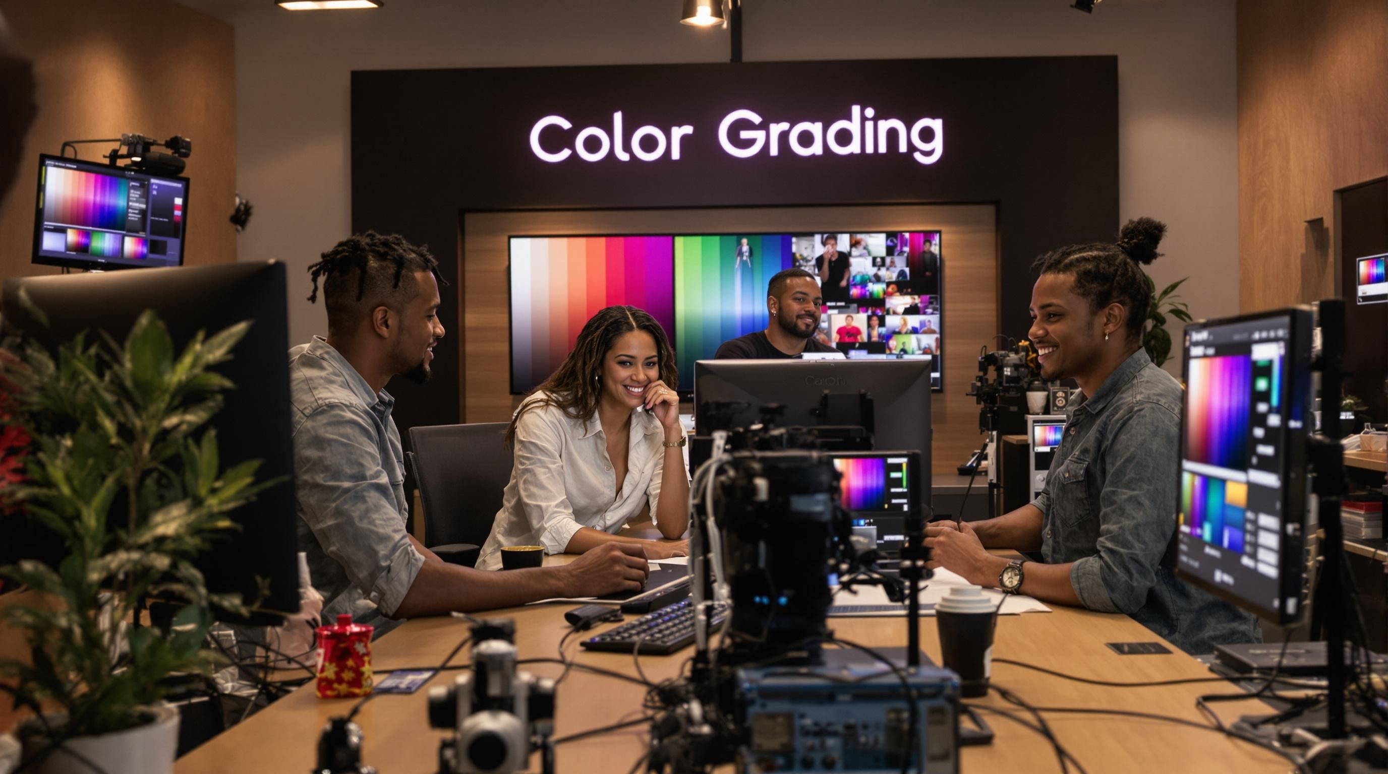
Essential Color Grading Techniques for Creatives
Advanced digital imaging research reveals that mastering color grading requires a sophisticated blend of technical precision and creative intuition. Professional creatives must develop a comprehensive toolkit of techniques that transform raw visual content into emotionally compelling narratives.
Primary Color Manipulation Strategies
Wikipedia’s comprehensive overview of color grading highlights the fundamental techniques that form the backbone of professional color manipulation. Primary color grading involves adjusting global color parameters across entire scenes or images. Professionals focus on three critical elements: color temperature, contrast, and saturation.
Color temperature manipulation allows creators to shift the overall warmth or coolness of an image. Warm tones (yellows and oranges) can evoke feelings of comfort and nostalgia, while cool tones (blues and teals) suggest emotional distance or technological environments. Contrast adjustment helps define visual depth, separating foreground and background elements while enhancing the image’s overall visual impact.
Advanced Selective Color Techniques
Selective color grading represents a more nuanced approach to visual manipulation. Government media experts recommend using targeted color adjustments to direct viewer attention and enhance narrative storytelling. Techniques like masking and secondary color grading allow professionals to modify specific color ranges or regions within an image.
Professionals use tools like color wheels, curves, and advanced selection masks to make precise adjustments. For instance, a colorist might desaturate background elements while maintaining vibrant colors in the primary subject, creating a visual hierarchy that guides the viewer’s eye. Vignettes and color gradients can further enhance this effect, subtly directing focus and creating depth.
Creative Workflow and Technical Refinement
Developing a robust color grading workflow requires continuous learning and technical exploration. Our comprehensive guide on photo editing terminology offers deeper insights into the technical nuances of professional color manipulation. Creative teams must balance technical precision with artistic intuition, understanding how subtle color adjustments can dramatically transform visual narratives.
Professionals recommend developing a systematic approach to color grading. This involves creating consistent color palettes, establishing reference images, and developing a repeatable process for color adjustment. Technical skills must be complemented by a deep understanding of visual psychology, color theory, and narrative design.
Ultimately, color grading transcends technical manipulation. It is an art form that requires creatives to develop a unique visual language, transforming raw imagery into powerful, emotionally resonant visual experiences. Each adjustment becomes a deliberate artistic choice, communicating mood, theme, and narrative depth through the subtle language of color.

Frequently Asked Questions
What is color grading?
Color grading is a post-production technique that enhances the visual aesthetics of footage by adjusting color tones, contrast, and saturation to create a specific mood or emotional impact.
How does color grading differ from color correction?
Color correction fixes technical issues like exposure and color balance, while color grading adds artistic elements to enhance narrative themes and emotional depth in visual storytelling.
Why is color grading important for visual storytelling?
Color grading shapes the emotional landscape of a visual piece, guiding viewer perception and enhancing narrative coherence, making it a crucial aspect of effective visual storytelling.
What are some basic techniques used in color grading?
Basic techniques include adjusting color temperature, contrast, and saturation. Advanced techniques involve selective color adjustments to draw attention to specific elements and enhance the overall narrative.
Elevate Your Color Grading Process With Effortless Collaboration
You have seen how mastering color grading demands both technical skills and creative vision. But getting feedback, sharing large files, or presenting your work can be tedious and slow. If you want every color choice to shine and each detail to stand out, you need more than basic file folders. Creatives deserve a platform built for their workflow, not against it.

Transform the way you share, review, and deliver your graded visuals with Pikd. Organize your color-graded work into beautiful branded galleries. Invite clients for real-time comments and download access without any signups. Want to streamline every review cycle and get your vision approved faster? See how Pikd turns color grading into a smooth team experience. Explore our platform today and start presenting your edits at a professional level.
Recommended
- Photo Editing Terminology Explained for Creatives 2025 - Webflow HTML website template
- PIKd Blog – Tips, Tools & Ideas for Sharing Photos Like a Pro
- What Is Visual Feedback? Essential Guide for Creatives in 2025 - Webflow HTML website template
- How to Create Moodboards: Step-By-Step Guide for Creatives 2025 - Webflow HTML website template